
A benefits utilisation dashboard for HR teams provides a clearer view of how employees use benefits, what programs cost, and where improvements may be needed. By combining benefits, HR, payroll, and employee feedback data, HR leaders can identify utilisation trends, evaluate plan performance, improve employee engagement, and make smarter, data-driven benefits decisions.
Key Takeaways
A benefits dashboard is most useful when it connects participation, utilisation, cost, and employee experience to decisions the HR team can act on.
- Define metrics before choosing charts or software.
- Combine benefits, payroll, HRIS, and feedback data carefully.
- Give executives, HR, finance, and employees different views.
- Investigate uneven utilisation instead of assuming the cause.
- Treat privacy, context, and review processes as core design requirements.
1. Understand what a benefits utilisation dashboard does
A benefits utilisation dashboard for HR teams brings scattered information into a consistent view of how people use their benefits. It should help HR move from retrospective reporting to practical questions: what is being used, by whom, at what cost, and with what experience? The strongest dashboards make those questions easier to explore without pretending that a number explains everything.
2. The role of benefits data in HR decision-making
Benefits data gives HR a clearer basis for allocating budgets, reviewing plan design, and planning communications. Participation can reveal whether an offer is reaching employees, while utilisation can indicate whether the benefit is relevant and accessible after enrollment. Used with care, clear decision context is more valuable than a crowded screen of metrics.
A good dashboard also makes assumptions visible. If usage falls, the team can ask whether employees lack awareness, face access barriers, or simply prefer another benefit rather than rushing to remove the program.
a. How dashboards differ from standard benefits reports
A standard report often answers one fixed question for one reporting period. A dashboard can bring several related measures together, allow filtering by period or employee group, and show relationships between participation, cost, and usage. It is less about making a report look attractive and more about shortening the path from evidence to a sensible next step.
b. The employee, employer, and finance perspectives
Employees want benefits that are understandable, accessible, and relevant to their circumstances. Employers need to know whether the package supports attraction, retention, wellbeing, and responsible administration. Finance teams need reliable figures for spend, forecasts, liabilities, and the effect of plan changes.
These perspectives overlap, but they are not identical. A low-cost benefit may still be valuable if it solves a meaningful employee need, while a popular benefit may require closer cost and capacity review.
c. When a dashboard adds the most value
A dashboard is particularly helpful during renewal planning, after a benefits launch, or when leadership is questioning program value. It can also support regular reviews when the organization has multiple locations, employee groups, providers, or funding arrangements. The point is not to monitor every measure continuously; it is to make important decisions less dependent on incomplete snapshots.
Before building one, agree on the decisions it should support. That simple step prevents the dashboard from becoming another destination where data is stored but rarely used.
3. Define the metrics your HR team should track
Metrics should follow the decisions the HR team needs to make, not the fields a provider happens to export. Start with a small set that covers reach, behaviour, financial impact, and employee response. Then define the population, time period, numerator, denominator, and source for each measure.
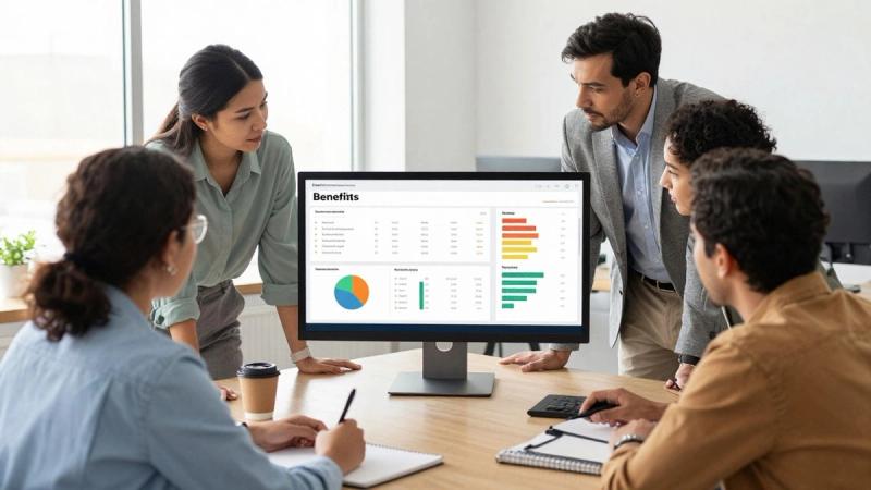
The visual layer should make changes easy to spot, while the underlying definitions remain available for anyone who needs to validate a result.
a. Enrollment and participation rates
Enrollment measures the proportion of eligible employees who select a benefit. Participation can describe actual activity after selection, depending on the program and the agreed definition. Keep the two measures separate so that a high enrollment rate does not disguise low use.
Break the figures down by eligibility, location, employment status, and plan option where privacy rules allow. A single organization-wide average can conceal groups that are not receiving the same practical value from the program.
b. Utilisation by benefit type and employee group
Utilisation should describe meaningful use for the benefit, such as claims, visits, wallet spending, event attendance, or completed appointments. The correct measure depends on the program, so avoid treating every interaction as equivalent. Comparing like with like matters more than producing a long list of activity counts.
A compact metric framework can help the team keep this work consistent:
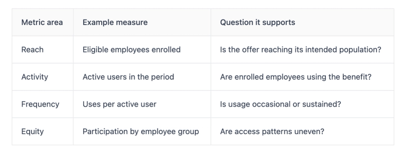
After reviewing the table, add qualitative context. A difference between groups is a prompt for investigation, not proof that one group values the benefit less.
c. Cost per employee and total program spend
Track total spend alongside cost per eligible employee, cost per enrolled employee, and cost per active user where those measures are meaningful. State whether the calculation includes employer contributions, administration, claims, provider fees, or other costs. Without that detail, two apparently similar programs may not be comparable.
Trend lines are usually more useful than isolated totals. They can show whether rising spend follows headcount, higher use, a plan change, or a shift in the mix of services employees select.
d. Employee engagement and satisfaction indicators
Engagement measures might include survey responses, communication reach, event attendance, repeat use, or completion of a benefits education activity. Satisfaction scores should be read alongside response rates and question wording. A small number of enthusiastic responses should not be treated as a complete view of employee experience.
Use feedback to explain the metrics rather than decorate the dashboard. If employees report that a benefit is difficult to understand, low utilisation may reflect communication or access problems rather than weak demand.
4. Build a reliable benefits data foundation
A polished dashboard cannot compensate for inconsistent source data. Start by mapping where eligibility, enrollment, payroll deductions, claims, usage, costs, and feedback are held. Document who owns each source and what happens when two systems disagree.
The foundation should support appropriate auditability without exposing more personal information than the audience needs. It also needs a practical operating rhythm, because a dashboard that is accurate only once a quarter may be unsuitable for weekly program management.
a. Connecting benefits, payroll, HRIS, and survey data
Each source answers a different question. An HRIS may establish the eligible population, payroll may confirm deductions or employer contributions, a provider may supply activity, and a survey may capture perceived value. Joining them requires stable identifiers, clear ownership, and rules for employees who join, leave, or change eligibility during a period.
Do not begin with a promise of perfect real-time integration. A dependable daily, weekly, or monthly refresh is often more useful than an unreliable live feed.
b. Standardising definitions across providers
Providers may use different labels for active users, claims, visits, approvals, reversals, and reporting dates. Create a shared data dictionary before comparing results. Record the business definition, calculation, source field, exclusions, and responsible owner for every key metric.
This is also where the team should decide how to treat refunds, late claims, duplicate records, and benefits that span more than one category. Consistency makes trend changes more credible.
c. Managing data quality, privacy, and access
Data quality checks should look for missing eligibility records, duplicate transactions, unexpected totals, and changes in the shape of the population. Privacy controls should limit access by role and suppress small groups where re-identification is possible. Retention and deletion rules belong in the design, not in a later compliance review.
For Hong Kong employers evaluating a broader benefits ecosystem, MixCare Health describes configurable employee benefit programs with analytics, compliance, and HR integration. Any platform or provider should still be assessed against the organization’s own governance requirements.
d. Setting reporting periods and refresh schedules
Choose reporting periods that match the decision cycle. Monthly data may suit budget reviews, weekly data may help with communications or events, and longer periods may be needed for seasonal or low-frequency benefits. Publish the last refresh date and the period covered so readers do not mistake stale data for current performance.
A short data-status note can prevent unnecessary debate. It should identify delayed sources, known exclusions, and whether figures are preliminary or final.
5. Design dashboard views for different stakeholders
One dashboard rarely serves every audience well. Executives need a concise view of direction and risk, HR needs operational detail, and finance needs definitions that reconcile to planning and accounting processes. Employees need useful information about access and value, not confidential group comparisons.
Design the views around decisions and permissions rather than giving every user the same controls. This makes the dashboard easier to use and reduces the risk of accidental disclosure.

The visual hierarchy should guide attention toward changes that warrant action, while preserving a route to the underlying definitions.
a. Executive summaries for strategic decisions
An executive view might show participation, utilisation, spend against budget, material changes, and a short explanation of the main drivers. Keep the number of headline measures limited and show trends rather than isolated scores. A senior audience should be able to understand what changed and what decision is being requested.
Avoid implying certainty where the data is incomplete. A clear caveat is more useful than a precise-looking figure built on unresolved assumptions.
b. HR team views for program management
HR users often need filters for location, employee group, benefit, eligibility, and period. They may also need operational indicators such as pending data, communication activity, provider issues, or follow-up actions. This view can be detailed, but each chart should answer a real management question.
A practical HR dashboard should connect insight to ownership. If a measure moves outside an agreed range, the next step and responsible person should be clear.
c. Finance views for cost and forecasting
Finance needs consistent treatment of committed, incurred, paid, and forecast amounts. Show actuals against budget and explain changes caused by headcount, utilization, pricing, plan design, or timing. Reconciliation to source systems should be possible without giving every viewer access to sensitive transaction detail.
A benefits budget is easier to manage when assumptions are visible. Include the population basis, contribution rules, and forecast period rather than presenting a single unexplained projection.
d. Employee-facing insights and communication needs
Employees should receive plain-language information that helps them understand what is available and how to use it. Appropriate content might include eligibility, remaining allowance, participating providers, or upcoming wellness activities, depending on the program. It should not expose small-group statistics or invite employees to infer personal health information from aggregate results.
Communication is part of utilisation management. If the dashboard shows that employees are missing a valuable option, the response may be a clearer explanation, a better enrollment journey, or a reminder at the right point in the employee lifecycle.
6. Use dashboard insights to improve benefits strategy
The dashboard earns its place when it changes a decision, not merely when it produces a monthly picture. Interpret trends with knowledge of plan rules, communications, workforce changes, and external events. Then test a focused response and observe what happens next.
The aim is not to maximize every kind of usage. Some benefits are designed for occasional high-value support, while others depend on regular engagement. The right question is whether the pattern fits the purpose and the people the program serves.
a. Identifying underused and oversubscribed benefits
Underuse may indicate low awareness, inconvenient access, narrow eligibility, or a mismatch between the benefit and employee needs. Oversubscription may reflect strong relevance, insufficient capacity, or a design that needs clearer limits. Compare usage with enrollment, communications, cost, and feedback before recommending a change.
A benefit should not be removed solely because its activity count is low. Consider the value of access, the seriousness of the need it addresses, and whether a modest communication intervention could improve reach.
b. Finding differences across locations and employee groups
Location, work pattern, language, age range, family status, and job type can influence how benefits are discovered and used. Segmenting data can reveal where a program is working differently, but the reason will rarely be visible in the dashboard alone. Use segmentation to form questions for listening, not stereotypes about employee preferences.
Set minimum group sizes and privacy safeguards before enabling filters. Small samples can create both disclosure risk and misleading conclusions.
c. Evaluating vendor and plan performance
Assess providers against agreed service, access, cost, and experience measures. Depending on the benefit, this may include processing timeliness, availability, satisfaction, error rates, communication support, and the quality of reporting. A single utilization figure is not a complete vendor evaluation.
For example, MixCare’s self-funded outpatient plan describes real-time visibility into spending and utilization, alongside automated claims processing and a doctor network across Hong Kong, Macau, and Singapore. Those documented capabilities may be relevant criteria when an employer is defining its own evaluation framework; they are not a substitute for reviewing its specific needs and results.
d. Turning usage trends into targeted interventions
Choose interventions that match the likely barrier. A confusing benefit may need simpler content, an inaccessible service may need a provider or scheduling review, and a new program may need manager and employee education. Record the intervention, audience, timing, expected result, and measure that will indicate whether it helped.
Small tests are often easier to interpret than a simultaneous redesign of the whole package. They also give HR a clearer basis for deciding what to scale, change, or stop.
7. Apply analytics responsibly and effectively
Benefits data can reveal sensitive information about health, finances, and personal circumstances. Responsible analytics therefore requires more than attractive charts: it requires purpose limitation, appropriate access, sound interpretation, and clear accountability. The dashboard should help people make fairer decisions, not encourage intrusive monitoring.
Write governance into the operating model. Define acceptable uses, prohibited uses, escalation routes, and review dates before the data becomes central to benefits planning.
a. Protecting sensitive employee information
Use aggregation, role-based access, encryption, retention limits, and careful handling of exports. Suppress small cells and avoid combining fields that could indirectly identify an individual. Employees should understand what is collected, why it is used, and who can see it when the law and organizational policy require that explanation.
Security controls should be assessed for both the dashboard and its connected sources. Convenience is not a reason to weaken privacy protections.
b. Avoiding misleading comparisons and assumptions
A rise in claims may follow a larger eligible population, delayed submissions, or improved access rather than poorer plan performance. Likewise, low usage may reflect a benefit designed for rare events. Always check denominators, time windows, population changes, and data completeness before drawing a conclusion.
Comparisons are strongest when the groups are genuinely comparable. If they are not, explain the limitation plainly and avoid ranking teams or locations without context.
c. Combining quantitative data with employee feedback
Numbers show what happened; conversations and surveys can help explain why. Use structured questions about awareness, access, relevance, and ease of use, then compare responses with participation and utilization patterns. Keep open-text feedback governed carefully because it may contain identifiable health or personal information.
A mixed evidence approach can reveal issues that a dashboard misses, such as a benefit employees value but find difficult to claim. It also gives HR a more respectful basis for changing the program.
d. Using AI and predictive analytics with appropriate oversight
AI may help classify records, identify unusual patterns, or support forecasting, but its output should remain reviewable. Document the purpose, input data, limitations, human reviewer, and action threshold. Do not use a prediction as a verdict about an individual’s health, commitment, or likely behavior.
Where a benefits platform uses AI-powered claims processing, ask how errors are handled, how decisions can be challenged, and what controls protect personal data. The technology should support accountable administration rather than obscure it.
8. Measure dashboard impact over time
Dashboard success should be measured by the quality and timeliness of decisions it supports, not by the number of charts or logins alone. Establish a baseline before changing the program, then track whether users can find reliable information and act on it. Review both operational outcomes and the experience of the people using the dashboard.
A small measurement plan is enough to begin. It can mature as the organization learns which views, alerts, and definitions genuinely affect benefits decisions.
a. Establishing baseline performance indicators
Record the starting participation, utilization, cost, satisfaction, data completeness, refresh timeliness, and time required to prepare reports. Note the population and period for each measure. Without a baseline, an improvement claim may simply reflect a change in calculation or workforce composition.
Also capture the decision process itself. How long did the team take to prepare a review, and how many manual reconciliations were needed? Those measures can show whether the dashboard is reducing administrative friction.
b. Tracking changes after benefits interventions
When HR changes communication, eligibility, plan design, or provider arrangements, mark the intervention in the reporting timeline. Compare relevant periods and account for seasonality, headcount movement, and other simultaneous changes. Where feasible, use a phased rollout or a comparable reference group, while respecting privacy and fairness.
The goal is not to claim perfect causation. It is to build a disciplined view of what changed, what might have contributed, and what should happen next.
c. Calculating return on investment
Return on investment may include avoided costs, reduced administrative time, improved participation, better employee experience, or reduced waste. Define the financial and non-financial benefits before calculating the result, and include implementation, communication, integration, and ongoing administration costs.
A credible ROI statement names its assumptions. It may be more useful to present a range or several scenarios than one highly precise figure that hides uncertainty.
d. Reviewing and refining the dashboard regularly
Hold a scheduled review with HR, finance, data owners, and relevant privacy stakeholders. Retire measures that no longer inform decisions, add measures when priorities change, and check that filters still produce defensible comparisons. User feedback should shape the next version as much as technical possibility does.
For practical HR planning and regional context, teams can also follow MixCare Health’s benefits insights. A dashboard should remain a working management tool, not a finished artifact that nobody is willing to revise.
Conclusion
A benefits utilisation dashboard becomes valuable when it turns trustworthy data into thoughtful action. Define the measures, build a dependable foundation, tailor views to each audience, and interpret trends with privacy and human context in mind; that is how HR teams make benefits decisions that are clearer, fairer, and more useful.
Frequently Asked Questions
What is a benefits utilisation dashboard for HR teams?
It is a visual reporting tool that brings together benefits eligibility, enrollment, usage, cost, and employee feedback so HR can monitor patterns and support program decisions.
Which benefits metrics should HR track first?
Begin with enrollment, active participation, utilization, cost, satisfaction, and data quality. Choose definitions that match the decisions your team needs to make.
How often should a benefits dashboard be updated?
The right cadence depends on the benefit and decision cycle. Weekly, monthly, or quarterly refreshes can all work when the period, last update, and known delays are clearly shown.
How can HR compare benefits across employee groups fairly?
Use consistent definitions, comparable populations, adequate sample sizes, and privacy safeguards. Treat differences as prompts for investigation rather than evidence of employee preference or performance.
What is the difference between enrollment and utilization?
Enrollment usually describes selecting or joining a benefit, while utilization describes meaningful activity after enrollment. Keeping both measures separate prevents participation from being overstated.
How should employee privacy be protected?
Limit access by role, aggregate results, suppress small groups, minimize personal data, set retention rules, and explain appropriate data use to employees.
How can HR tell whether a benefits change worked?
Set a baseline, record the intervention, compare suitable periods, account for other changes, and combine dashboard measures with employee feedback. Use the evidence to refine the next action rather than claiming certainty too quickly.
MixCare Health
MixCare Health · Hong Kong